-
Light & Colour In Smart Design
January 2013
Interior decoration is often used to enliven space. It is contrived towards enhancing space; it can set the mood, create genial vibes in an internal environment and has a direct bearing on human psychology. Its need is strongly felt today with technological advancements, tough targets and stringent timelines that have resulted in high levels of stress among humans. Whether it is an office interior, recreational, home interior or health care centre, effectively designed space contributes to a balanced and enriching environment.
By Chiranji Abeywickrema
Colourisation and lighting are major component in all interior design schemes. Use of colour in a room is not merely a surface decoration it has a stimulating effect on the brain. Warm colours such as orange, red and yellow are used for vibrancy and excitement while cool colours such as blue and green gives a more relaxed feeling. Warm colours in a commercial interior can sometimes stimulate spontaneous selection and impulse buying, while red lighting can give the impression of time passing slowly. Cool colours on the other hand are ideal for places of deliberate planning and waiting areas, blue lighting creates the impression that time passes quickly.
Inspiration for colourization is found in nature itself. Colour of the sky is usually lighter compared to the colour of earth. Foliage takes on a medium tone. Sky, sea and the beach is another example where light, medium and dark tones are experienced in nature. Light colours on the ceiling gives a room an elevated feel, while dark colours make the ceiling feel low and near. According to colourist Jil Pilaroscia, people are generally comfortable with a light coloured ceiling, dark coloured floors and a medium colour used for the walls as nature suggests in its examples.
Correct proportions of colour in an interior can be psychologically stimulating and stunning. Architect Michele Fonseka in her design for the lobby and reception areas of Aitken Spence, Colombo has used shades of blue and green handloom in juxtaposition with a white background. This has created an elegant and refreshing interior. Blue is associated with the client’s cooperate imagery, while a splash of lime green serves to accentuate and inspire. The resultant interior is attractive with a relaxing quality to it that welcomes and holds the visitors proceeding through to the office levels.
“Colour is a phenomenon of light’ and is an extremely useful tool for a designer”.
Light has a spectacular impact on colour. Varying degrees of light can animate a coloured surface. Light colours reflect light, while dark colours absorb it. An abundance of light falling upon a dark coloured surface can heat up the interior. The orientation of a room in relation to the sun path should be considered in selecting colours for an interior. Colours will appear different with the type of light source and intensity of light. A warm colour can look brighter with afternoon sun light falling on its surface. Incandescent or halogen light can be used to enhance warm colours whereas fluorescent lights with a blue or green tinge can dull their appearance.
‘Color is a phenomenon of light, which is about vibration (oscillation), and musical sound is also vibratory in nature.’
– Jill Pilaroscia
Dialog Arcade, Nawala is a futuristic interior with a strong dialogue between colour and light. Coloured luminaries articulate glossy surfaces animating the interior. The boundaries of space vanish in a double height volume housing the reception, lobby and customer service counters. Glossy black rings are suspended from its ceiling – an element introduced to create a balanced sense of scale in an illusion of vastness created by the reflective interplay of light. Graphics designed by Sheran Henry Associates further strengthens the corporate presence while polished tiles and metal cladding used on the floor define space and direct the visitors.
“Color in certain places has the great value of making the outlines and structural planes seem more energetic.”
– Antonio Gaudi
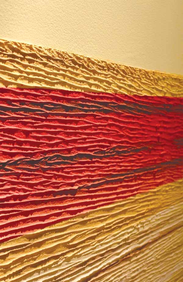
Transformation of a barren space with a sterile quality to an intimate, homely environment is a challenging task. A simple reference to colour in such instances can prove welcoming and uplifting. Architect Dilini Mapagunaratne has expressed a strong sense of colour with minimal interventions to the existing set up of a domestic interior, the result of which is aesthetically appealing and economical. Colours of the setting sun have provided inspiration to a textured wall featuring hues of yellow, orange and red. Warm white light is used to enhance its presence guiding the guest to a cosy interior of analogous colours with a contrasting element of zestful red.
“The orientation of a room in relation to the sun path should be considered in selecting colours for an interior”
“Emotional excitements measured by changes in blood pressure and pulse rate occur by association. Green may recall nature or mountains. Red may recall the sunset or a fireplace. These superficial associations lead to deeper lying memories.”
– Felix Deutsch
‘Colour is a phenomenon of light’ and is an extremely useful tool for a designer. Its careful orchestration can be delightful to the senses and can touch the very soul.


