-
The ‘LOOP’
April 2010
By Chamindra Warusawitharane | Photography by Waruna Gomis
On the way to the Bandaranaike International Airport from Colombo any passer by would be tempted by the welcoming ambience of the ‘LOOP’- restaurant and café in Kandana. 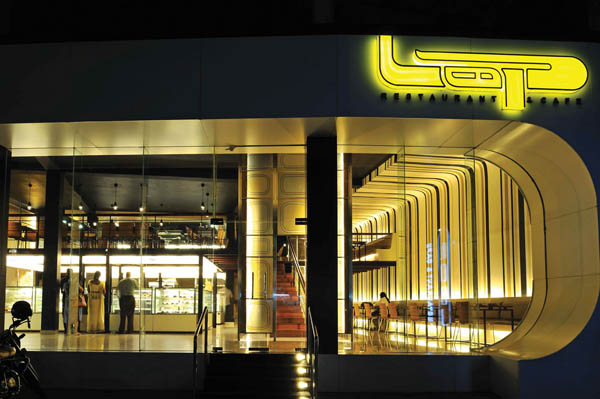 Archt Shayan Kumaradas was given a partly constructed building and briefed by the owners of the food chain to design a captivating interior. “In order to attract attention, we generally focus on one aspect of the building and make it stand out and tone down the balance. This is what we did with the LOOP,” explained Archt Kumaradas.
The unusual plan form of the building presented a challenge since it was neither square nor rectangular. The Architect manipulated this space and created a structure that resonates the name ‘LOOP’ with its curves and softened edges.
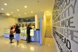
The very first glimpse of the building presents a view of the two highlights of the building, the white northern wall decorated with graffiti and the two arresting backlit ‘lanterns’. The ‘lanterns’ hide two staircases, which the architect added to give a touch of playfulness. “There was no need for two staircases but we built two to lighten the atmosphere and give it an air of playfulness. Children can go up one staircase and come down the other” added Archt Shayan Kumaradas.
The two sections of the building were separated yet conceptually linked. The first section flanked by the northern wall is the take away area, which is designed in such a way that the customer would want to glance at the other section: the dining area. The dining area on the ground floor also integrates an extensive display area. White walls and stainless steel create an immaculate atmosphere. The office situated in the ground floor is hidden from view yet it provides a good view of the activities taking place in the display area.
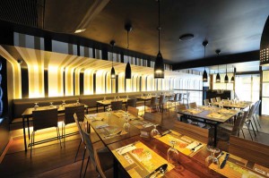
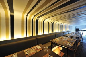
The two staircases encompassed by the lanterns lead to the mezzanine floor, which consists of a satellite kitchen, a spacious dining area and rest rooms. Archt Kumaradas incorporated empty space instead of covering the entire area with the mezzanine floor to give an open feel to the room. Steel and timber were used for the decks. “We created a double height space on the mezzanine floor where the main dining happens,” commented Archt Kumaradas.
The lighting was manipulated to bounce on the surfaces instead of directly falling on to them, which highlighted those surfaces while the others blended in with the surroundings. In order to tone down the whole effect and soften the uneven edges only four colours were used and certain areas were painted black allowing those to melt in to the background. “We mainly focused on attracting attention to the northern wall and the two lanterns. The top part of the building which remains unused is almost invisible,” Archt Kumaradas reiterated.
Thus, amidst the furore of Kandana an atmosphere has been created in which the discerning traveler would be tempted to enter and relax.
Principal Architect: Shayan Kumaradas
Architectural assistants:Darshana Rodrigo, Amjad Mansoor
Client: Thakshila Foods
Square area of the interior: 5,500 sqft
Date of completion: March 2009
Main Contractor: Design World

