-
Lessons in Light and Space
March 2008
from factory to nature-loving corporate space
By Ruwani Dharmasiri | Photographs by Eresh Weerasuriya
This is a building which does not necessarily stand out dramatically from its surroundings, but which would pique the interest of any curious passerby due to its quizzical exterior. It’s the outcome of following a spontaneous design approach to the conversion of a former chocolate factory to be the new headquarters for Jinadasa Garments.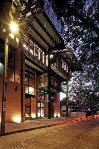
Perhaps it’s all in the design approach of Architect VijithaBasnayake, who manipulates his design skills with a purpose; a creative visualiser who believes that “an interesting section would lead to an interesting building,” which leaves all his buildings with an organic and improvised look. He is an architect who believes in “growing his buildings out of the context, and being rather uncomfortable in building structures which stand out in the context.”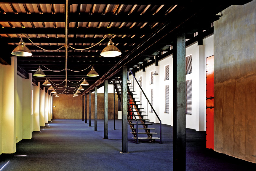
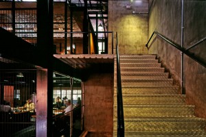
The Jinadasa Garments head office is entered through a spacious entrance lobby, and into three levels of office space accommodated in an L-shaped building, a central lift and a courtyard. The narrow, elongated wing of the L-shape is rented out and Jinadasa Garments operates in the front block facing the entrance, accommodating a variety of formal and informal meeting and working spaces. The meticulously detailed mezzanines in the first floor definitely adds to the upbeat vibes, while doubling up as additional office space.
The building has several unique or outstanding aspects: it reuses an existing building; is energy efficient; provides a considerable variety of custom-built spaces; and has an overall ‘look’ of having evolved from the low key setting. Archt. Basnayake appears to have transformed an existing chocolate factory to a very ‘green’ office building.
The complex building façades are an outcome of the ‘purposes’ with which the architect has planned the inner spatial arrangements. The interiors depend entirely on natural light and ventilation.
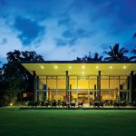
 The building is entered through a veranda-like space under the shade of roof eaves and a Bo tree across the road which is very much a part of the building in its visual and spatial experience. The Bo tree (ficusreligiosa), a sacred tree in Buddhist culture and ritual has an inherent calming effect in the rustle of its leafs, extends the boundaries of the building and creates a soft enclosure under the shade of its drooping foliage at the entrance and filters glare-free light into the building.
The roof is an element which is an inherent part of the vernacular architecture of Sri Lanka. We are comfortable with roofs and eaves, which are necessary in our tropical climatic conditions, and they are a culturally important element suggesting the idea of enclosure and safety. The long-drawn roofs propped into the structure at the entrance area of the building, which are like giant tongues, adds a familiar, comfortable feeling to the building.
The complex building façades are an outcome of the ‘purposes’ with which the architect has planned the inner spatial arrangements. The interiors depend entirely on natural light and ventilation. The façade, thickly layered with canopies, pergolas, roof eaves, fins and pelali (rattan blinds), is a sandwich of materials and devices, manipulated to draw in breeze and light and to keep out the glare and rain. 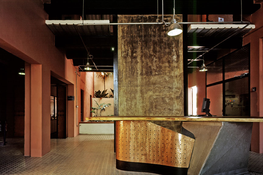 Not only does this help to keep the energy costs low, but it also produces a refreshing breeze as air is drawn in from the fenestrations and drawn out through a centrally located courtyard.
The structure defines itself as existing and extended; the extended and the new is out of exposed steel and partitioning from porous steel grill work, all strategically used to allow the natural breeze to travel through.
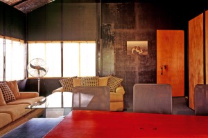
The interior has acquired an aesthetic, which is techno-art-industrial, through its use of material texture and color. The industrial look of the interior is heightened by the bold use of light fittings, wall fans and exposed service lines which are as straightforward and simple as the way in which the building draws the energy that it consumes: a natural order.
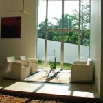
The dramatic space inside with double height volumes in places as central meeting places or main working areas; low ceiling areas which accommodate services; lunch rooms and work areas of cubicles; and, the deck space which contain more individual workstations all create an interesting variety and interaction in this office environment.
What appealed to me most, and lingered in the mind as I left the building, was the spatial quality which has an intangible atmospheric charm – the collective effect of the spatial volume, material, texture, and the softness of the interior light – provides an enveloping comfort, rather like the Bo tree across the street.